Locotown Festival
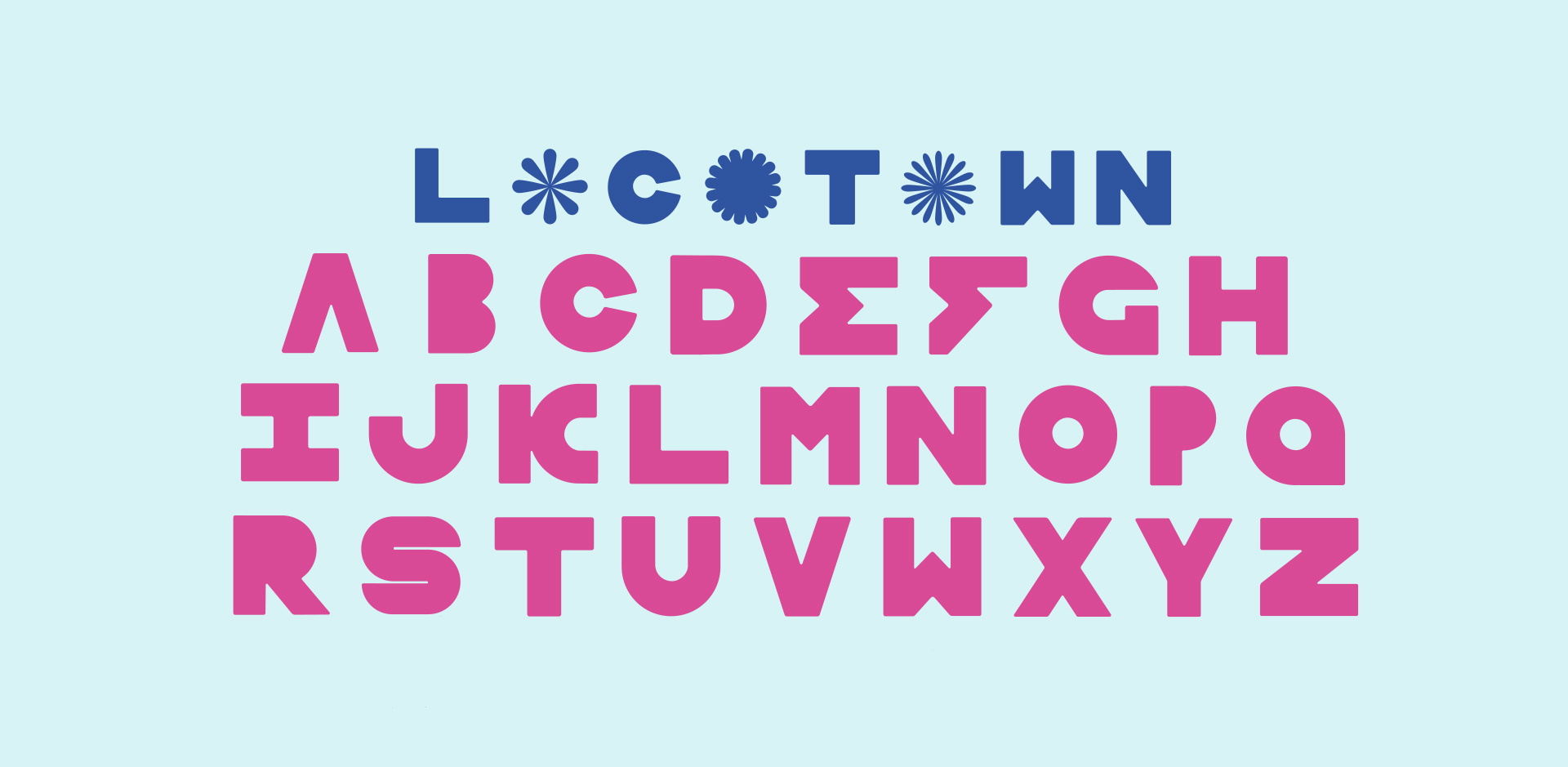
Locotown’s identity visually represents the excitement and irresistible energy found at an electronic music festival.
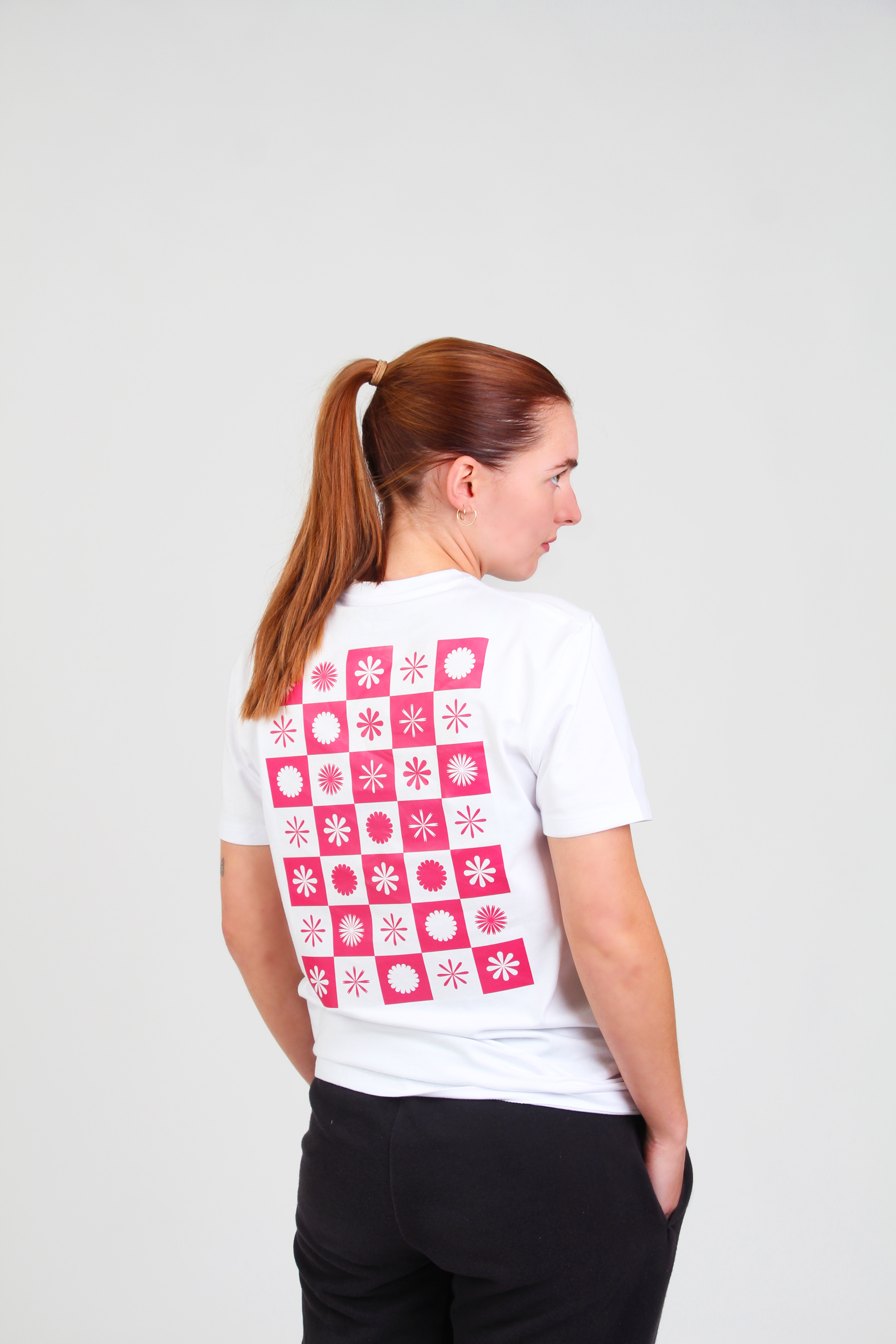
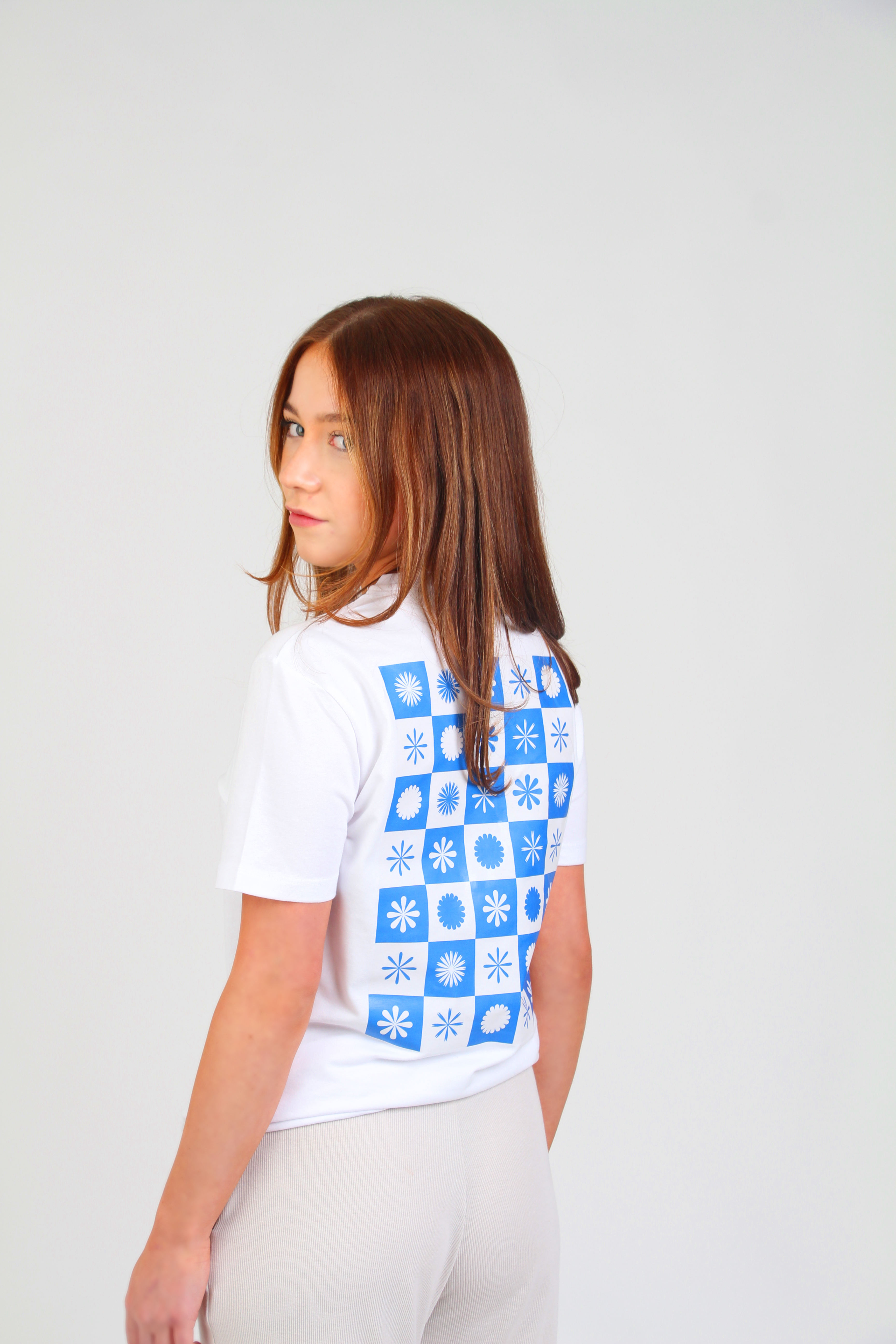
A unique aesthetic was developed by studying the icons and patterns found in board games and card games so themes of fun and playfulness can be demonstrated through the design.
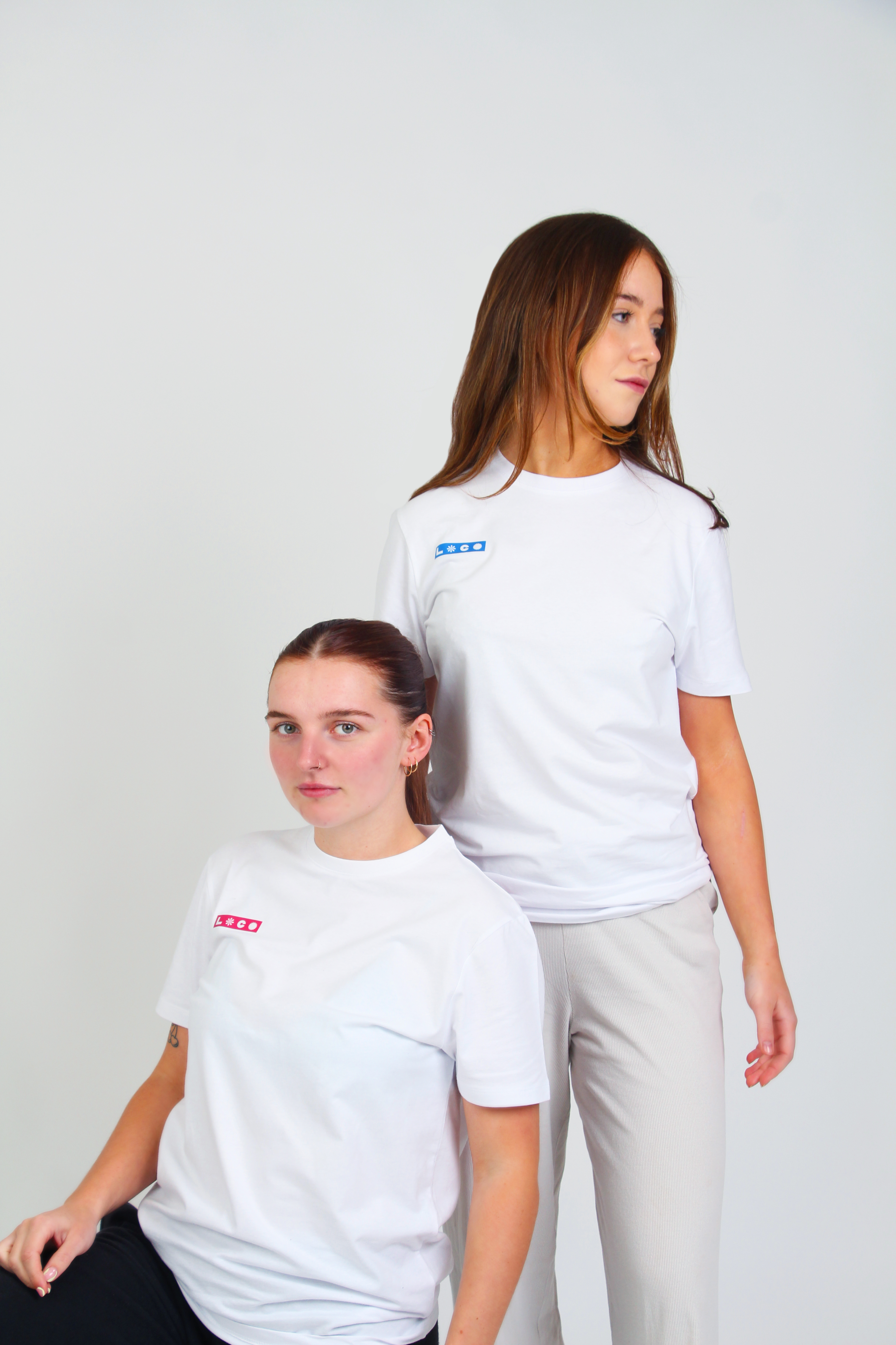
Locotown pairs together radiant colours, striking icons and animations to reveal the best electronic festival lineup of the summer.
A unique aesthetic was developed by studying the icons and patterns found in board games and card games so themes of fun and playfulness can be demonstrated through the design.
Locotown pairs together radiant colours, striking icons and animations to reveal the best electronic festival lineup of the summer.


The design is influenced by play as creating and animating the pattern involved playing with the squares to find which piece went where. Just like a jigsaw puzzle or Tetris.
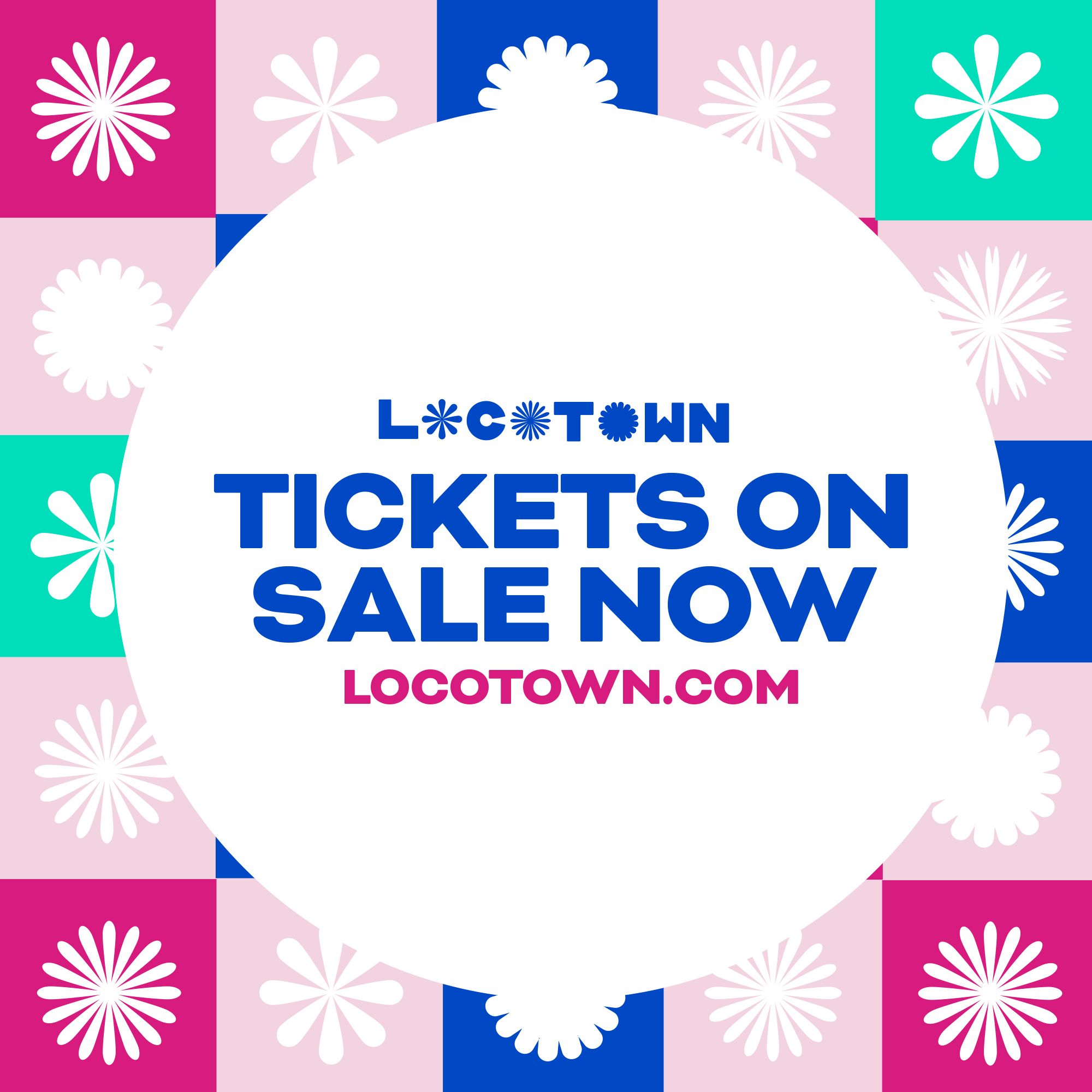

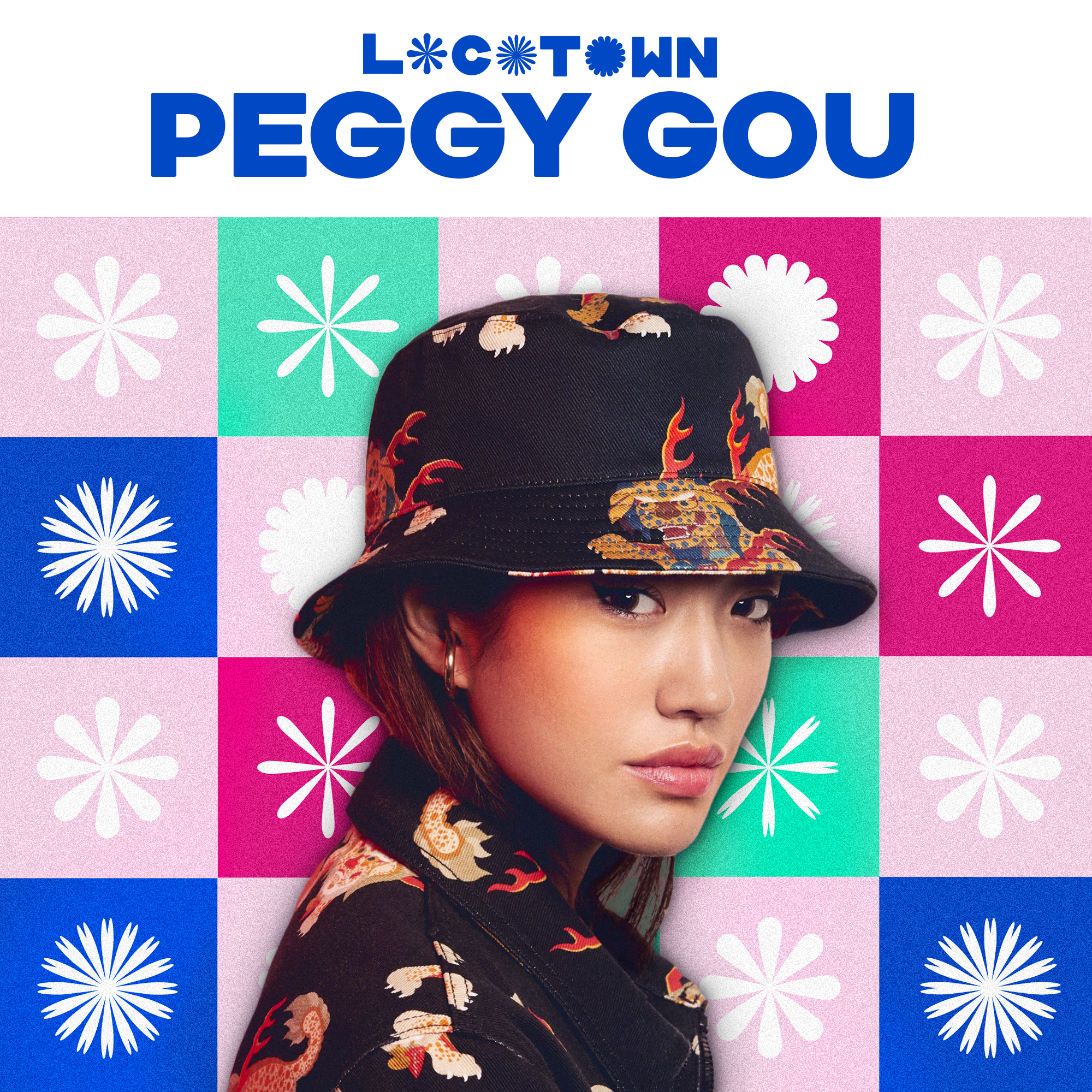

The beginning of my design process involved placing elements inside a grid of squares but no font would fit inside the grid. The Locotown typeface was designed to complement and adhere to the checkerboard grid.